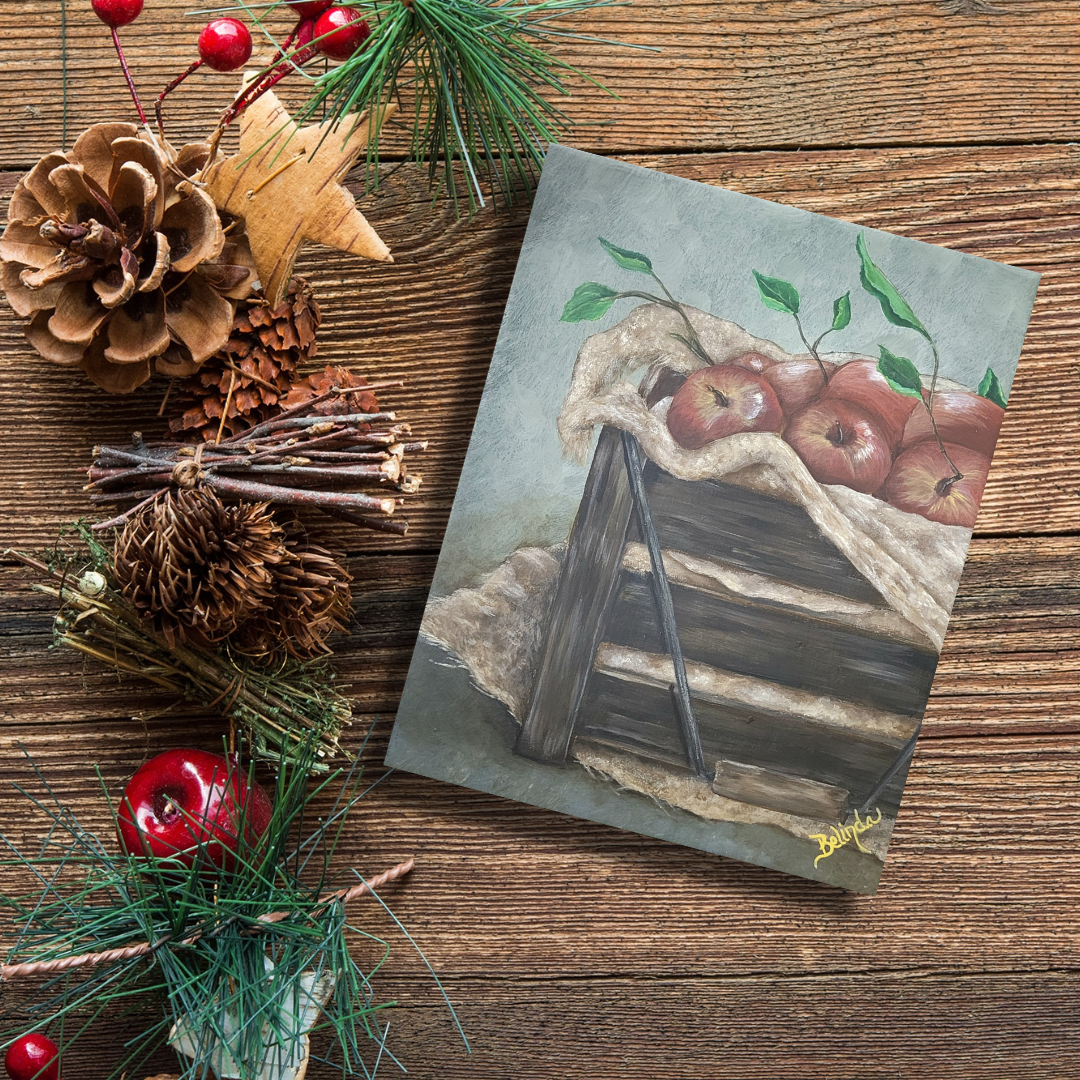
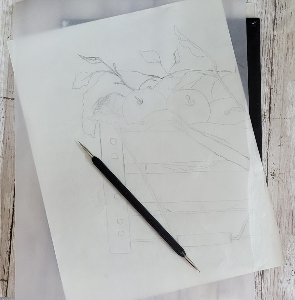
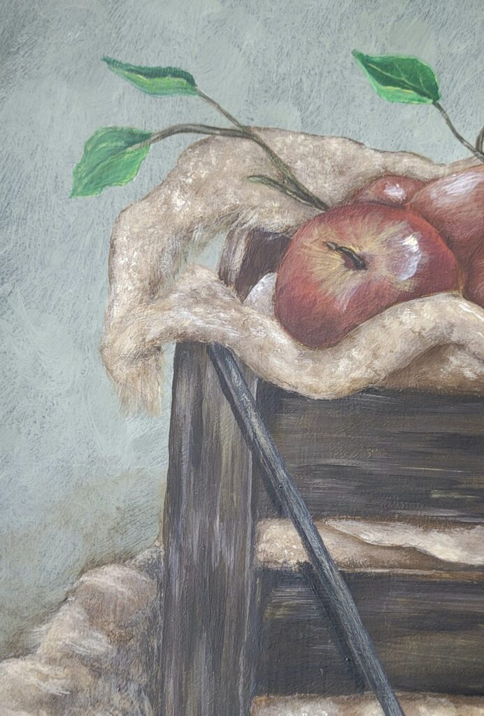
Painting Blog Banner

Be’s Designs: Rustic Harvest

Rustic Harvest

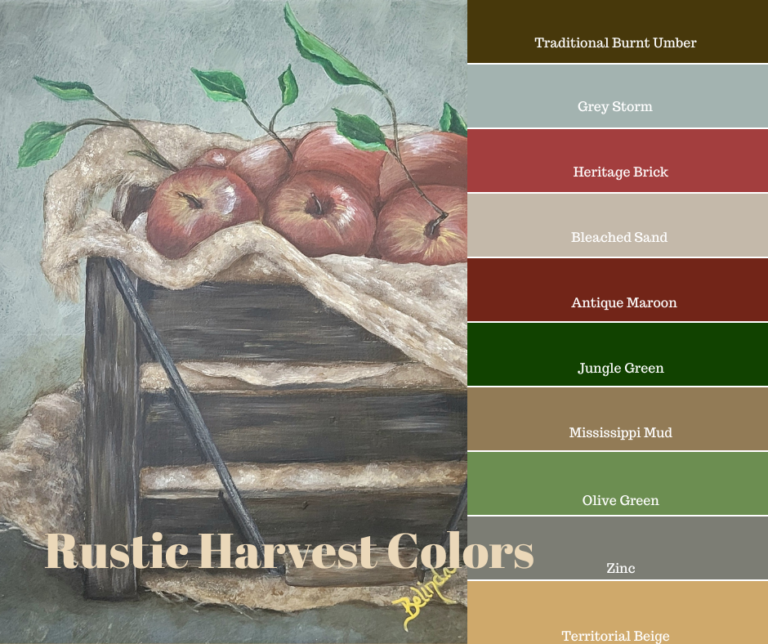
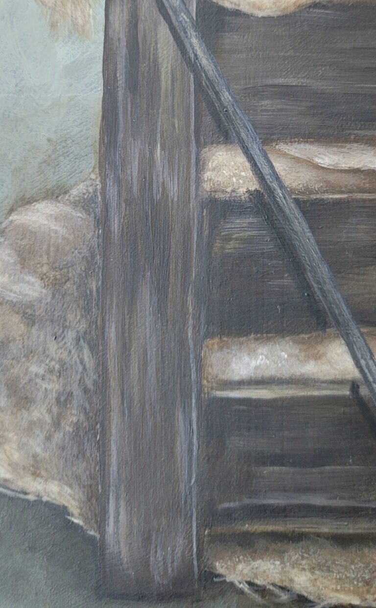
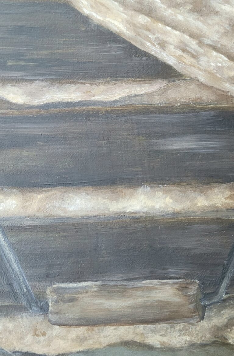
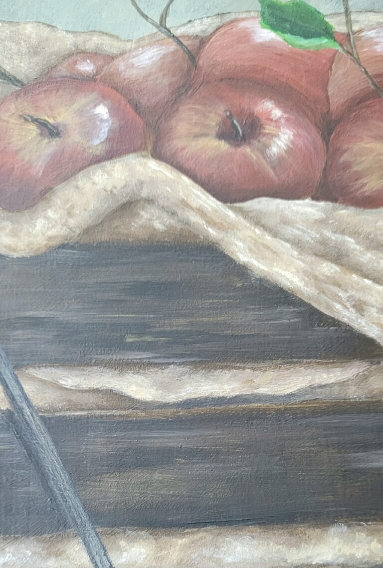
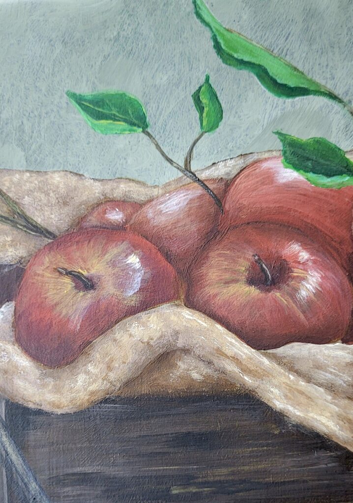
8" x 10" Ceramic Tile

Disclosure: My Be’s Designs posts are a behind the scenes look into what I do to get from inspiration to finished painting. I will go by step by step everything I do and focus on what went well, what didn’t and tips and tricks I come across along the way.

In the words of the immortal character Sophia Petrillo: Picture it! Harvest time. 2023.

A young girl is walking through an apple orchard searching for the perfect fruit. She is overcome with the smells of autumn and can’t contain her excitement as she looks up at gnarled and twisted tree that holds the most perfect apple she has ever seen. She immediately raises her arm to grab the fruit and is amazed as she smells it that it holds all the aromas and memories of fall in the one little fruit. This is a magical time and she wishes she could preserve this feeling forever.

This is some of the visual images that  I had in my head while I was painting  Rustic Harvest.

Apples are a subject that I have painted in the past but I wanted to try to do something a little different. I have been fascinated with the rustic look in decorating and I have always thought that it ties in nicely with my style and the themes that I try to tie all my work to: nostalgia and the simplicity of the past.

Reference Photos:

Details of the Piece:

  • Acrylic on 8” x 10” ceramic tile.

Colors:

Americana and Anita’s Acrylic Paint

Notes:

  • This painting was challenging to me in a lot of ways. First was the texture in the wood of the crate. I wanted to create a texture that was aged and I wanted to give the impression that this crate was well-used and worn. I didn’t want it to feel like it was new or recently purchased. That is the reason for the darkness in the color of wood. It is much darker in color and texture that the reference photo that I used.
  • I spent a lot of time recreating the texture of the burlap that lines the crate. I didn’t want to give the feel and look of burlap without making it a carbon copy of the reference photo. Burlap has a very loose weave and I could spend days and weeks recreating the weave of the fabric and I think, in the end, I wouldn’t have been at all happy with the finished product. This way I give an idea of burlap and it fits in with the rustic feel of the rest of the painting.
  • I had originally intended to have the crate sitting on a wooden table or floor, but as I was painting I decided against it. As I was progressing I realized that the wooden crate was becoming the focus of the piece. I originally believed the apples were the focus but my eye was always being drawn to the center mass, which was the crate. Since that was now the focus I decided to change gears and use the burlap to help draw the eye to the crate. Having that much textured wood with the crate and the table would have been too much chaos that would have made a mess of the painting

Progress Shots:

Step 1: Background

Create background with Black, Zinc and Storm Gray.

Step 2.

Transfer cartoon onto tile using tracing and white graphite paper.

Step 3: Crate.

Using colors black, Traditional Burnt Umber, Mississippi Mud, Territorial Beige, and Bleached Sand.

Step 4: Burlap.

Zinc, Territorial Beige,Mississippi Mud and Bleached Sand

Step 5: Apples and Leaves

Heritage Brick, Antique Maroon, Territorial Beige, Bleached Sand and White.

Jungle Green, Olive Green, Gray Storm and Bleached Sand.

Want to learn more about this piece and other fall pieces in my studio, then head on over to my site: bedesignedartstudio.com/ for more details.

Thanks for reading!

P.S. Make sure that you sign up for my monthly FREE ART GIVEAWAY! Just CLICK HERE or fill out the form below with your name and email address and you will be set to get your FREE art delivered to you instantly! A special Thank You from me to you!

Share this: